I drove customer-centric product design for an early-stage startup targeting a promising emerging consumer market (cannabis).
Role:
-
- Head of Design
Responsibilities:
-
- Build the design team & systems from the ground up
- Lead product design, including competitive analysis, customer research, wireframing, prototyping, testing, & constantly improving UX
- Provide guidance for all things design-related
- Foster an inclusive & collaborative culture rooted in deep understanding of our customers & their needs
Results:
-
- Led the customer-focused redesign of the e-commerce website
- Created a robust design system that created improved UX coherence & engineering velocity
- Designed a 2nd e-commerce site harmonized with the main site
- Redesigned all brand collateral
- Provided clear design style guide & product specs
- Drove brand growth with social media & marketing campaigns
Bud.com is a technology service platform provider that serves California's booming legal cannabis industry. It enables adults to easily order and receive their favorite cannabis products. I brought an ambitious vision to the small team:
Create the most beloved brand in California's cannabis market.
I rallied the executive team around the insight that people fall in love with brands that love their customers.
We would show love to our customers every step of the way, from our first contact through their journey of product discovery, shopping, delivery, customer support, engagement on social media – every engagement. We would be fanatical about creating outstanding experiences for our customers.
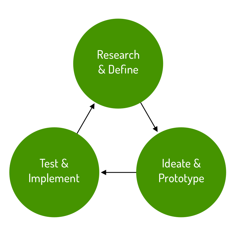
To deliver on this vision, I charted the path forward according to the proven human-centered design process (shown here in simplified form).
Design Process: Research & Define
In addition to being the starting point and foundation of all our work, this is also an ongoing process that continues to be updated and improved throughout the prototyping & implementation phases.
Key elements of our research & definition phase consisted of:
-
- Contextual inquiry - Observe people shopping for cannabis, learn about their processes, walk in their shoes & develop empathy, identify patterns, & document findings
- Heuristic evaluation of the legacy website, including severity rankings
- Competitive analysis - List & rate competitors' design elements, strategies, strengths & weaknesses
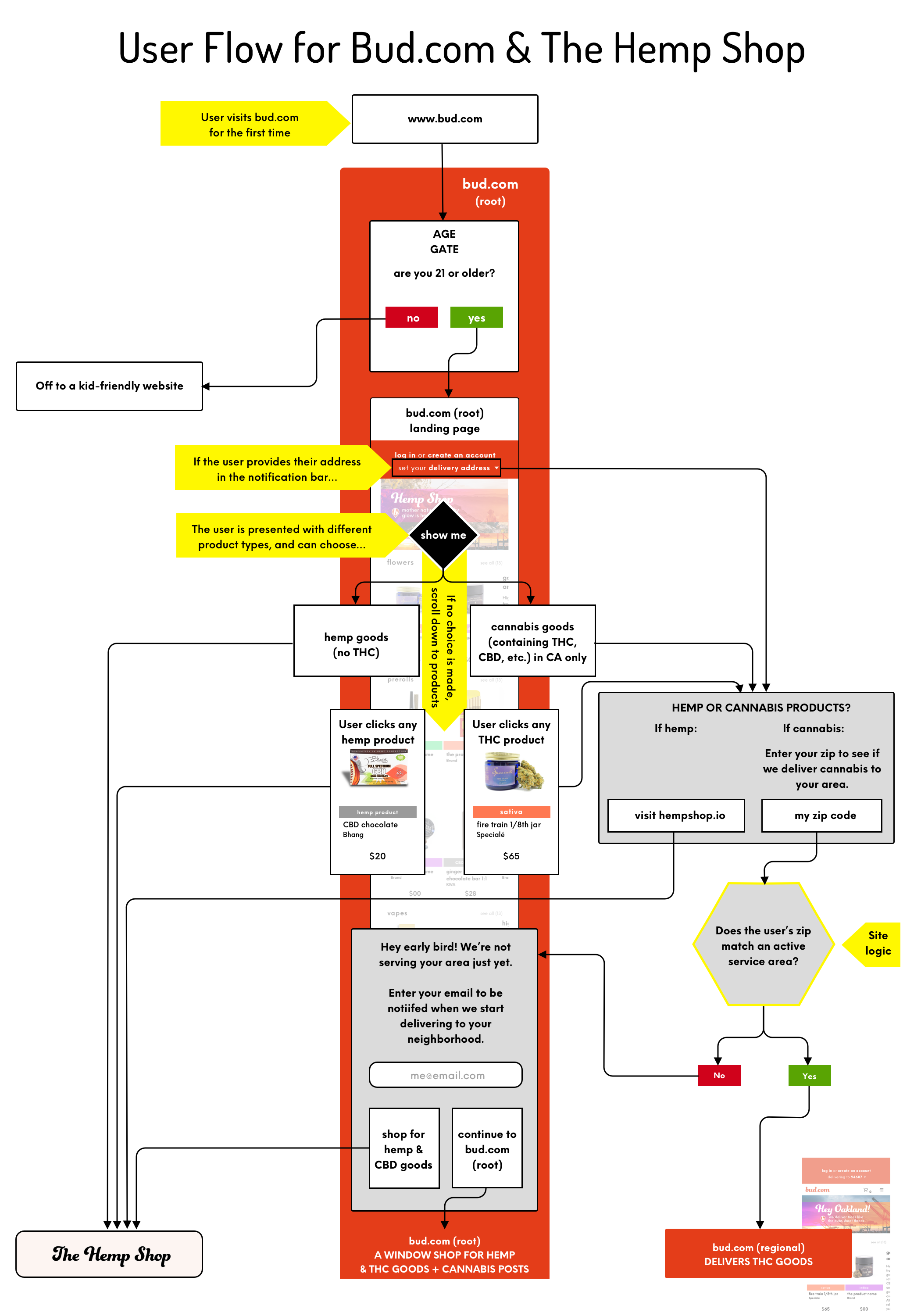
- Define key research findings & design strategy via design artifacts including personas, user flow diagrams, information architecture, & a design style guide
Design Process: Ideate & Prototype
Translating the key insights of research into tangible, interactive models that can be tested & rapidly improved.
The ideate & prototype phase consisted primarily of:
-
- Wireframing & rapid prototyping - Create numerous divergent design explorations that meet the defined user & business needs
- UI & Interaction design - Design all the user interface elements and behaviors, & document in the design style guide
- Visual design - Design all the graphic elements, including colors, fonts, padding, content, & layouts
- Clickable prototype design - Render the solution that best meets the user and business needs in high fidelity, interactive mode
- Product specifications – Document all design guidance in detailed specs that include colors, patterns, behaviors, interactions, & microinteractions, and clickable prototypes
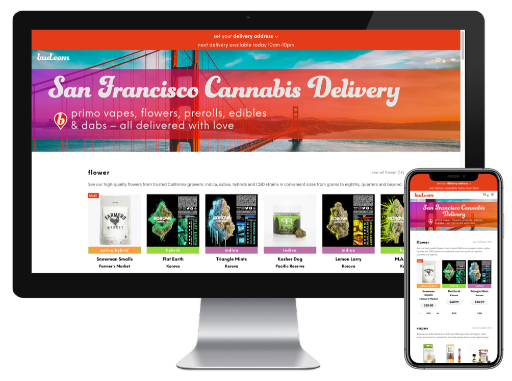
This desktop masthead design evolved over several iterations in collaboration with our SEO team. Together, we fine-tuned the H1 & H2 copy, tested the results, and made improvements to assure that it would meet the two key user & business requirements:
-
-
- Offer a welcoming UX
- Provide optimal visibility to search engines
-
Once we had validated the effectiveness of this design via Google Analytics, it served as the template for all our regional stores - San Francisco, Oakland, San Mateo, Marin, & Sacramento.
Design Process: Test & Implement
Does the prototype meet the users' needs? How useful do they find it? Where are their pain-points? What can be improved? Usability testing allows us to find these things out and make the necessary corrections before launch.
Testing of our early prototype (above) revealed the need for the following key UX & UI improvements:
-
-
- scrolling notifications on the top notification bar
- larger click zones on the product cards' onHover/onTap states
- ability to index the weight up/down on the product cards
-
Also, the executive team flagged the need for the following UX & UI improvements:
-
-
- more product type identifiers
- change the "curtains-closed" age-gate to a version that provided a view of the products on the site
-
All of this was built into subsequent versions of the prototype, documented in the design spec, and ultimately launched on the live site.
Branding & Marketing
In addition to e-commerce design, I did a complete rebrand of the company. Working closely with the CEO and CTO over more than 30 iterations, I designed new logos that profoundly elevated the look & feel of the brand.
My initial design experiments involved sans-serif shapes that played with the mirror-image nature of the word "bud," and rendered the ".com" much smaller. The early concepts felt modern & minimal, but also rather cold, and therefore not in sync with our target users.

Also, given the company's distinctive three-letter domain and the strategic importance of driving traffic there, we decided that the ".com" should be the same size as the "bud." To warm things up and make the wordmark feel more welcoming, I shifted to a flowing cursive style. Combined with a deeply saturated orange-red color (#e43d19, a warm tone that alludes to the heart and the love we feel for our customers), this ultimately created the desired effect.
Once the wordmark was dialed, the design of the brandmark flowed quite naturally.
Given the fact that bud.com specializes in the delivery of cannabis, and that maps are such an essential part of the delivery process, it felt fitting to integrate the shape of a map pin into the design of the brandmark.

Due to the fact that we were running a fast-paced startup, it wasn't possible to spend as much time testing these designs as I would have liked. However, our guerilla testing produced unanimously positive results, so our entire team felt good about rolling out our new identity to the world.


Bud.com Team Feedback
"Shalom joined our team at a very early stage. As Head of Design, he immediately put on many hats: redoing our logo, managing contractors for art production, engineering a redesign of our e-commerce website, and developing a social media presence - executing on each skillfully without many resources. He drew upon his deep experience in human-centered design to hold a torch aloft for our customers. It was a busy, hectic time in a chaotic, emerging industry, and Shalom’s positive attitude kept us aloft through difficult months. He fearlessly dove into learning and connecting with people inside and outside of the company. His documentation was impeccable, and his use of our internal tools vigorous. We will miss Shalom's infectious good cheer and rigorous approach to our design challenges."
- J. H., CTO
"Shalom is a leader unlike any I’ve experienced before. His level of creativity, integrity, and genuine concern for people (customers, teammates, & everyone) is off the charts. The way he puts all his heart & soul into his work inspires us all to do the same, to be constantly listening and improving, and to be fanatical about customer experience. I learned so much while working with him and seeing how he puts his heartfelt human-centered design philosophy into action. Any company would be super fortunate to have Shalom expertly leading the charge for design."
- J. G., Customer Service Lead


